Ever pulled into your driveway and thought, “Hmm… something feels off”? I’ve been there. I once repainted a house exterior, thinking I nailed the color, only to step back and realize it clashed with the roof like socks with sandals. Lesson learned. Choosing the best exterior color schemes for curb appeal isn’t just about picking a shade you like. It’s about balance, light, surroundings, and a bit of gut feeling. In this guide, I’ll walk you through real, workable ideas that actually look good in everyday neighborhoods. No fantasy homes. Just honest, practical color combos that make people slow down when they pass your house.
1. White and Charcoal Gray
This combo never feels tired. I see it work on small cottages and larger homes alike.
White keeps things bright, while charcoal gray adds weight and contrast. The trick? Use white on the main body and gray on trim or shutters.
Why does this work so well?
- It suits sunny and cloudy climates
- It pairs nicely with stone or brick
- It feels clean without screaming for attention
Ever notice how this look makes a home seem sharper right away?
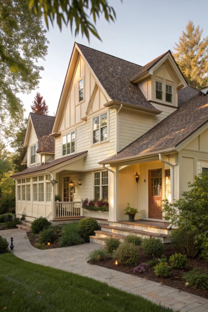
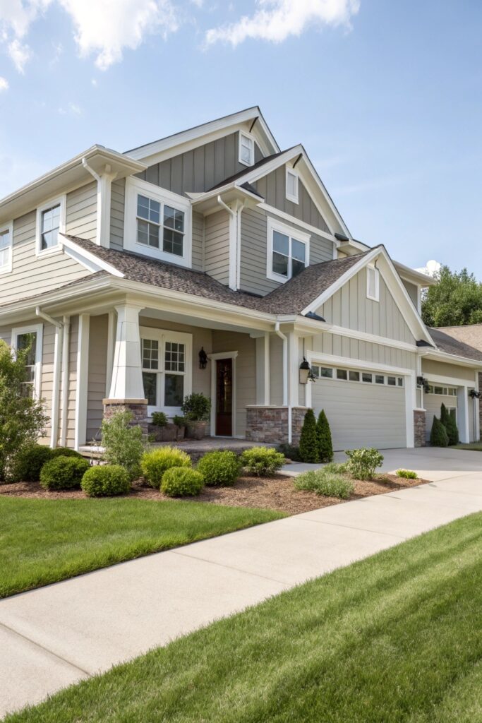
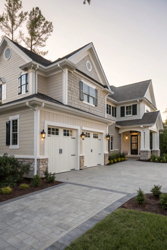
2. Cream with Warm Taupe
Pure white can feel harsh. Cream softens everything.
Taupe adds warmth without drifting into brown overload. I’ve used this scheme on a family home near lots of trees, and it blended perfectly.
Key reasons to love it:
- Easy on the eyes
- Works with beige or brown roofs
- Feels welcoming, not flashy
If your goal involves comfort over drama, this one fits.
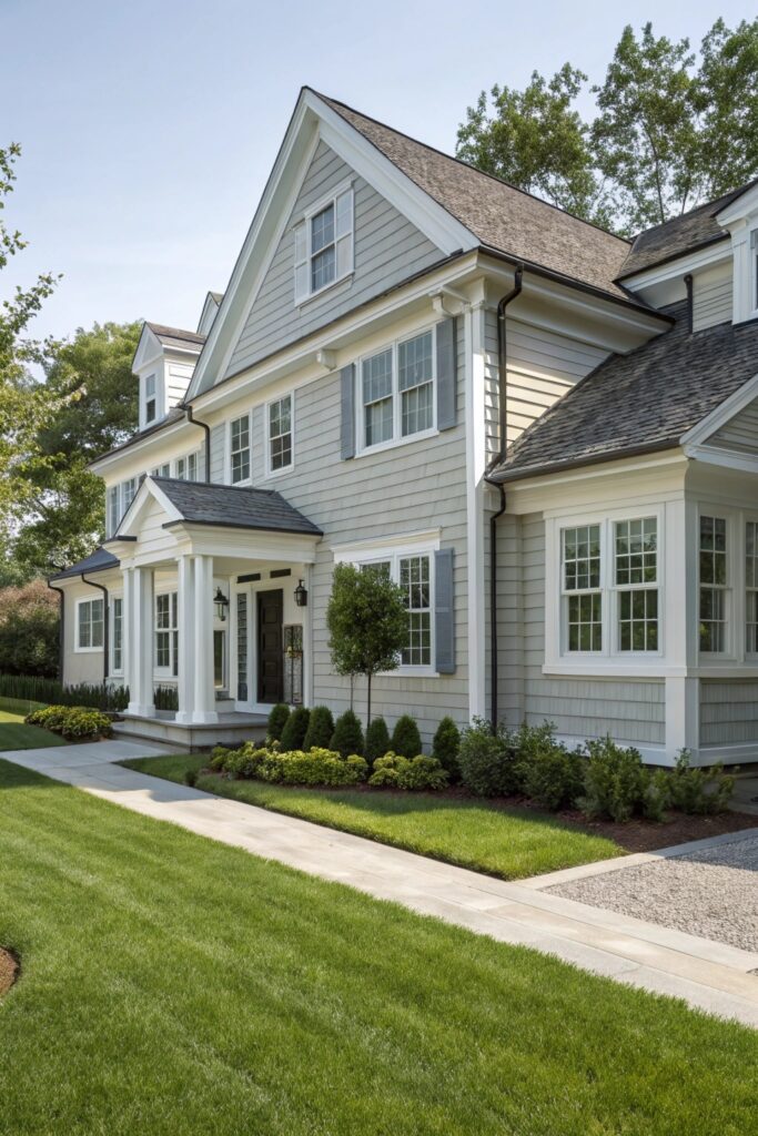
3. Soft Gray with Crisp White Trim
Gray gets a bad reputation for being dull. That only happens when people pick the wrong shade.
A soft gray paired with bright white trim feels balanced. I suggest this to anyone nervous about color choices.
Why it’s a safe bet:
- Fits many house styles
- Makes trim details stand out
- Looks neat year-round
Want a calm look that still feels fresh?
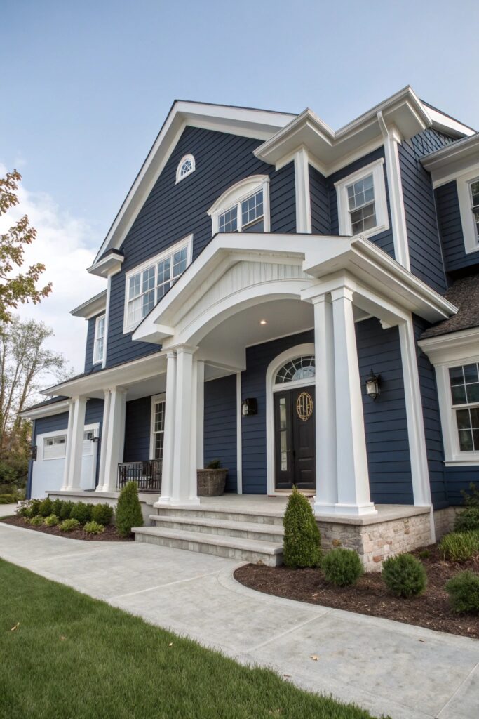
4. Navy Blue and Bright White
This one turns heads without trying too hard.
Navy blue grounds the house, while white trim adds sharp lines. I once saw a modest suburban home look custom-built just from this combo.
Keep in mind:
- Use navy on siding, not trim
- White windows really shine here
- Add brass or black hardware for extra style
Yes, dark colors can work. You just need balance.
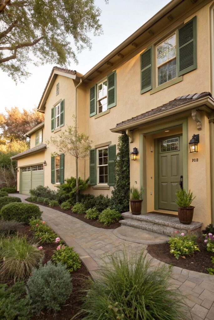
5. Beige with Olive Green Accents
This pairing feels relaxed and grounded.
Beige handles the main space. Olive green adds character through doors or shutters. I’ve seen this shine in areas with lots of plants.
Why it clicks:
- Blends nicely with landscapes
- Feels calm, not boring
- Adds color without chaos
Do you want color without stress? This does that.
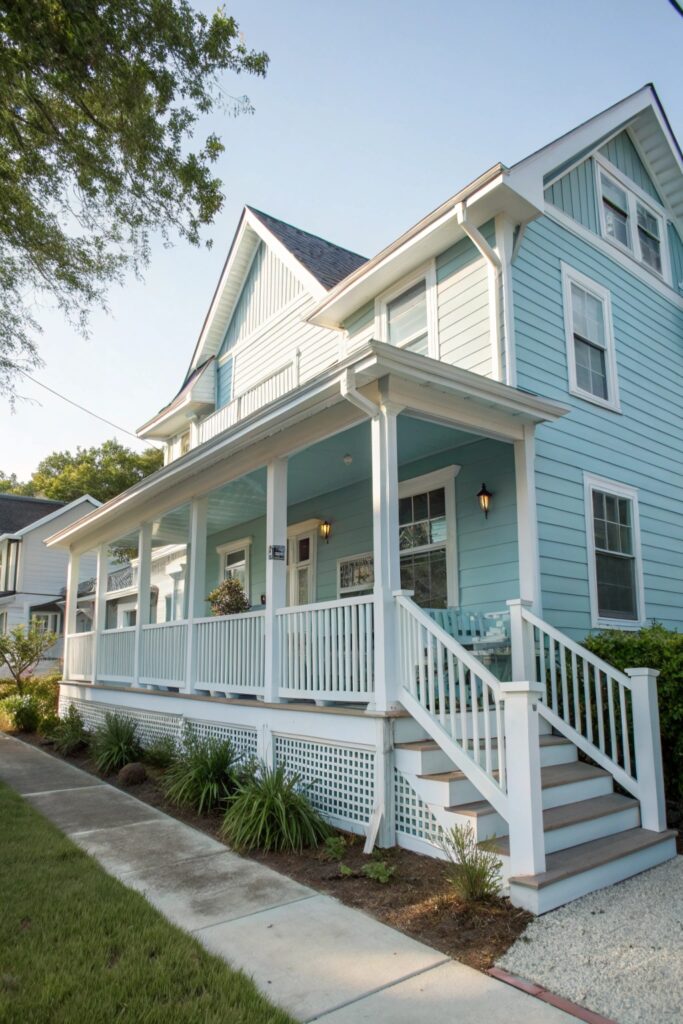
6. Light Blue and Soft Gray
This combo reminds me of coastal homes without looking themed.
Light blue feels airy. Soft gray keeps things mature. I’ve recommended this for homes with plenty of sunlight.
Helpful notes:
- Avoid overly bright blues
- Gray should stay gentle, not dark
- White trim finishes the look
Who doesn’t enjoy a relaxed, breezy feel?
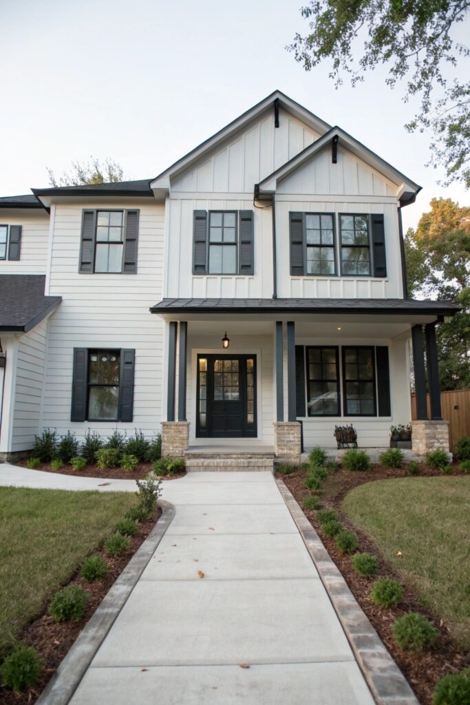
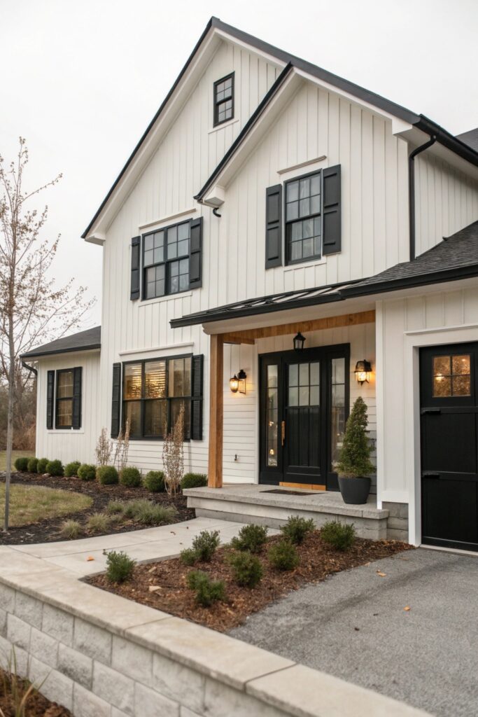
7. Warm White with Black Accents
This scheme cleanly brings drama.
Warm white softens the contrast. Black accents add structure. I once doubted black trim until I saw it in real life. Instant convert.
Why people love it:
- Strong contrast without harshness
- Works with metal or wood details
- Feels bold but still friendly
Want your house to look confident?
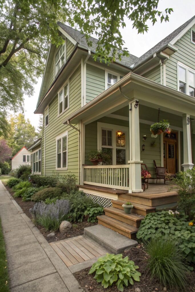
8. Sage Green and Off-White
Sage green feels calm and natural.
Off-white keeps it light. I see this a lot in quiet neighborhoods, and it always fits.
Why it works:
- Easy on the eyes
- Pairs well with wood accents
- Looks good in all seasons
Nature-inspired colors rarely disappoint.
9. Greige with White Trim
Greige sits right between gray and beige.
That balance makes it incredibly flexible. I suggest this when people feel stuck choosing between warm or cool tones.
Reasons to pick it:
- Matches many roof colors
- Feels modern without cold vibes
- Ages well over time
Ever wish for a color that just behaves? Greige does.
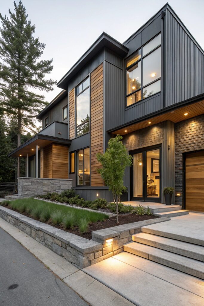
10. Charcoal with Natural Wood
This combo feels bold yet grounded.
Charcoal sets a strong base. Wood tones add warmth. I’ve seen this shine on newer builds and remodels.
Things to note:
- Use wood sparingly
- Keep charcoal matte
- Add soft lighting for balance
Dark doesn’t mean gloomy if warmth joins in.
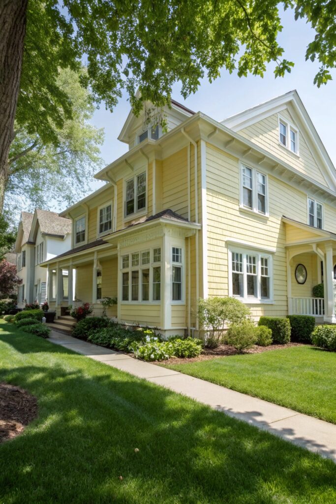
11. Pale Yellow with White Trim
Yellow scares people. Pale yellow shouldn’t.
It feels cheerful without shouting. I’ve seen it brighten streets that felt dull.
Why it surprises people:
- Feels sunny even on cloudy days
- White trim keeps it neat
- Works best in soft shades
Wouldn’t a little warmth feel nice?
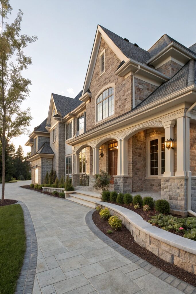
12. Stone Gray with Cream Accents
Stone gray adds weight. Cream softens edges.
I like this for homes with brick or stone features. It feels steady and refined.
Why it’s practical:
- Hides dirt better than white
- Feels timeless
- Works in urban and rural areas
This one quietly does its job.
13. Soft Taupe with White and Black Details
Taupe feels cozy. Black details sharpen it.
I’ve seen this make average homes feel thoughtfully designed.
Helpful tips:
- Keep taupe light
- Use black sparingly
- White trim balances everything
Sometimes subtle contrast works best.
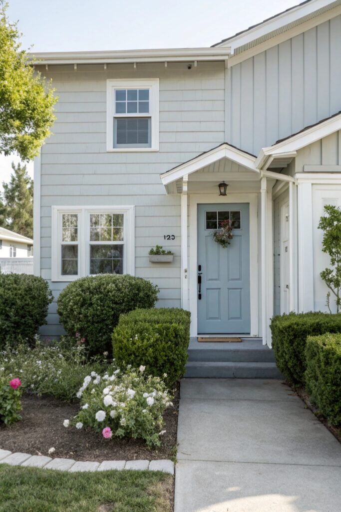
14. Light Gray with Muted Blue Door
This combo keeps things simple but adds personality.
Light gray stays neutral. A muted blue door adds charm. I always smile when I see this setup.
Why it stands out:
- Easy repaint option
- Adds focus to the entryway
- Feels welcoming
Who says doors can’t have fun?
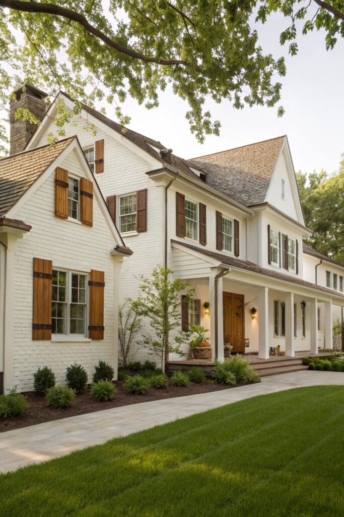
15. Classic White with Soft Brown Accents
White homes feel timeless when done right.
Soft brown accents add warmth without heaviness. I’ve seen this work beautifully with wooden shutters.
Why does it last?
- Fits many styles
- Feels warm and clean
- Easy to update later
Sometimes the simplest choice wins.
Final Thoughts
Choosing the best exterior color schemes for curb appeal doesn’t require stress or wild risks. It requires balance, a little patience, and honest thinking about your home and surroundings. I’ve seen homes gain instant charm just from smart color choices. Look around your street. Notice light, trees, and roof tones. Then pick a scheme that feels right, not trendy. Your house should feel like a friendly wave, not a loud shout. Ready to give your exterior the attention it deserves?
